 By Sofia Bennett, Home & Decor Editor
Reviewed & updated September 2026
Paint is the cheapest, highest-impact change you can make to a bedroom, and it's also the one people agonize over the most — because unlike a throw pillow, you're living with it every night. Here's how to actually pick a color that reads calm in daylight and cozy at night, not just on the swatch.
 Quick navigationCurated by Sofia · 7 min read
- Why bedroom color matters more than other rooms
- The undertone problem (and how to avoid it)
- Warm neutrals: the safest restful choice
- Muted greens: calming without being cold
- Deep, moody tones for a cocoon effect
- Soft blues: the classic “sleep color”
- Accent wall vs. full room
- Matching paint to your ceiling and trim
- The takeaway
- Related articles
- Further reading & trusted sources
Why bedroom color matters more than other rooms
A living room gets used in bursts throughout the day under changing light and company. A bedroom is used at the two ends of the day when light is dimmest and you're the most sensitive to visual noise. Colors that feel energizing in a kitchen can feel agitating at 11pm in a bedroom, which is why the "restful" palette for a bedroom is narrower than for the rest of the house.
The undertone problem (and how to avoid it)
Almost every bad bedroom paint choice comes down to an undertone nobody noticed on the swatch card. A "greige" that looks like a soft neutral in the store can pull noticeably green or purple once it's on four walls under your room's specific light. Before committing:
- Buy a sample pot and paint a 2×2 foot section on at least two different walls (north-facing and south-facing light differ enormously).
- Check the swatch at three times of day: morning, midday, and with your lamps on at night.
- Hold the swatch next to your existing floor, trim, and bedding — undertones clash more with materials than with each other.
Warm neutrals: the safest restful choice
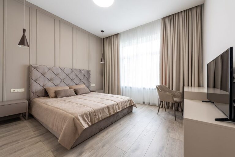
Soft warm neutrals — greige, warm taupe, soft oat, muted clay — are the most reliably calming category because they read as "absence of color" rather than a specific mood, and they play well with almost any bedding or wood tone. This is the right call if you change decor often or you're not confident picking a bolder color.
Look for neutrals with a warm (not cool/blue) undertone specifically for bedrooms — cool grays can feel sterile and cold once the lights are low.
Muted greens: calming without being cold
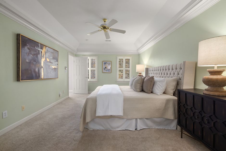
Sage, eucalyptus, and other muted, grayed-down greens have become one of the most popular bedroom colors of the last few years for good reason — green sits at the center of the color wheel and reads as naturally calming without the coldness that can come with blue or gray. Keep the saturation low; a bright grass green will energize a room, while a dusty sage will settle it.
Deep, moody tones for a cocoon effect
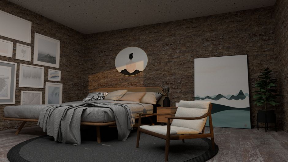
Charcoal, deep navy, forest green, and warm espresso browns have moved from "bold design risk" to a genuinely popular restful choice, especially in bedrooms that get good natural light during the day. A dark wall can feel enveloping and cozy rather than gloomy — the key is pairing it with warm lighting (lamps, not overhead fluorescents) and enough contrast in your bedding and trim that the room doesn't read as a cave.
Soft blues: the classic "sleep color"
Pale, dusty blues are the most research-cited "calming" bedroom color, and they hold up well because a soft blue rarely clashes with wood tones, white trim, or most bedding. The mistake is going too saturated or too cool — a bright sky blue or an icy pale blue can feel more like a nursery or a clinical space than a restful adult bedroom. Aim for a blue with some gray mixed in.
Accent wall vs. full room
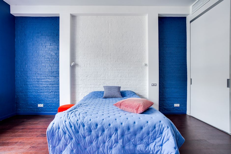
An accent wall (usually the headboard wall) is the lower-commitment way to try a bolder or darker color without repainting the whole room, and it also gives your eye a natural focal point that a fully painted room doesn't. Full-room color creates a more immersive, cohesive feel and is generally the better choice for softer, more neutral colors where you want the whole space to feel unified rather than to spotlight one wall.
Matching paint to your ceiling and trim
A restful bedroom usually benefits from keeping ceilings a soft white or a very slightly tinted version of the wall color (some paint lines offer this as a built-in option) rather than stark bright white, which can feel harsh against a warm or moody wall color. Trim can stay crisp white for contrast, or match the wall in a matte finish for a more cocooned, seamless look — both work, it's a style choice rather than a rule.
The takeaway
The most restful bedroom colors share three traits: muted saturation, a warm undertone (even in blues and grays), and a finish that looks intentional rather than accidental under lamp light. Test generously with real paint on real walls before committing, lean warm-neutral if you're unsure, and don't be afraid of a deeper, cocoon-like color if your room gets good daylight to balance it.
Frequently asked questions
What's the single most calming bedroom paint color?
There's no universal answer, but muted sage green and dusty warm blue consistently test as the most broadly calming across different people and lighting conditions — both sit in cooler, lower-saturation ranges that read as restful rather than stimulating.
Should I paint my bedroom ceiling the same color as the walls?
It's optional. A matching or slightly lighter tinted ceiling creates a more enveloping, cocoon-like feel, while a soft white ceiling keeps the room feeling more open — both work well in bedrooms, it comes down to personal preference and ceiling height.
Are dark bedroom colors a bad idea in a small room?
Not automatically, but they're riskier — a small room with limited natural light can feel heavier and more closed-in with a dark color. If your small bedroom gets strong daylight and you like a moody look, test a large sample first.
How do I know if a paint color has the wrong undertone for my room?
Paint a real sample directly on your wall (not on paper) and check it in morning light, midday light, and lamp light. If it looks noticeably green, purple, or pink in one of those conditions when you wanted a neutral, that's the undertone showing through.
Read next
Related articles
- 18 DIY Wall Art Ideas to Fill Empty Walls for Less
- How to Choose Wall Art and Prints That Elevate Any Room
- How to Create a Spa Bathroom on a Budget
- 22 Small Bathroom Ideas to Make It Feel Bigger
- How to Set a Beautiful Dining Table (Everyday and Holiday)
- 30 Small Kitchen Storage and Organization Ideas
Further reading & trusted sources
A small thing that makes a big difference
Almost every paint regret traces back to skipping the on-wall sample step — a color that looks like a soft neutral on a swatch card can pull visibly green or purple once it’s rolled onto four walls under a room’s specific light. A $6 sample pot checked at three different times of day catches nearly every undertone surprise before it becomes a full repaint.
Sofia is happiest hunting down the high-end look for a fraction of the price; she’s convinced a beautiful room comes from restraint and clever styling far more than from budget. She shapes Dreamy Dwell’s room-by-room guides around ideas you can actually copy in a rental or on a tight budget — no staged ‘this is my mansion’ fantasy. AI tools help with the research and first drafts, and a human edits every piece before it goes live. We never fake reviews or pass off a styled photo as a real before-and-after.