 By Sofia Bennett, Home & Decor Editor
Reviewed & updated September 2026
Color drenching is the interior design trend where a single color is used on the walls, trim, ceiling, and sometimes even the doors and built-ins of a room — instead of the traditional white ceiling and trim with color on the walls alone. Done well, it makes a room feel intentional, cohesive, and surprisingly larger, not smaller. Here's how the effect actually works and how to try it without a full renovation budget.
 What you’ll find insideCurated by Sofia · 8 min read
What Color Drenching Actually Means
Traditionally, a room is painted with the walls in a color and the ceiling and trim in white or off-white — this creates visible breaks between surfaces. Color drenching removes those breaks by using one paint color (or very close tonal variations) across walls, ceiling, trim, and doors. The room reads as one continuous envelope of color rather than a box with painted sides.
The effect is a room that feels enveloping and cohesive rather than chopped into segments by contrasting trim lines. It's a design move that's been used by professional designers for years and has become widely accessible as more people paint their own rooms.
Why It Works (Even in Small Rooms)
The counterintuitive part of color drenching is that it often makes small rooms feel larger, not smaller — which runs against the old rule of "paint small rooms white to open them up."
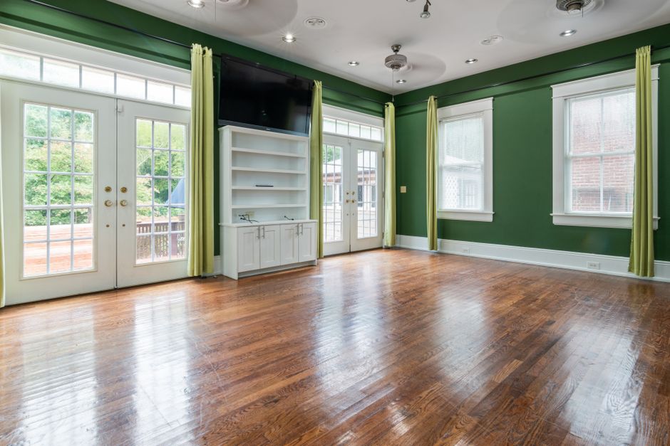
Here's why: when trim and ceiling are white against a colored wall, your eye catches on the contrast lines where wall meets ceiling and wall meets trim, which visually defines — and limits — the boundaries of the room. Remove that contrast by drenching everything in one color, and your eye stops registering the edges as sharply. The room reads as a continuous space rather than a clearly bounded box, which tricks the eye into perceiving more depth.
This is especially effective in rooms with awkward proportions — a low ceiling, an oddly angled nook, or a room with more doors and windows than wall space. Drenching smooths over those irregularities instead of drawing attention to them with contrasting trim.
Which Rooms Work Best
Bedrooms are the most popular starting point — the enveloping, cocoon-like effect suits a space meant for rest, and you have full control over the mood without worrying about resale-driven neutral advice.
Powder rooms and small bathrooms are a low-risk, high-impact choice. Since these are typically the smallest rooms in a home, a bold drenched color feels dramatic without overwhelming daily living space.
Home offices and reading nooks benefit from the enclosed, focused feeling color drenching creates — useful for a space meant for concentration.
Living rooms and kitchens can work too, but require a lighter touch (softer, more neutral-adjacent tones) since these are higher-traffic, higher-natural-light spaces where a very saturated dark color can feel heavy over long periods of daily use.

How to Choose a Color That Won't Feel Overwhelming
Start one or two shades lighter for the ceiling. A pure monochrome match on every surface is the most dramatic version, but a very slight lightening of the ceiling shade (same color family, just 10-20% lighter) keeps the room from feeling like a closed box while still reading as one cohesive color story. This is a common professional compromise.
Consider your natural light. North-facing rooms with less direct light can handle — and often benefit from — deeper, richer colors since they won't wash out. South-facing rooms with strong direct light can support a wider range including lighter drenched colors that would look flat in a dim room.
Test a swatch on multiple walls, not just one. Color drenching means you're committing to the color across every surface, so a swatch that looks great on one accent wall might read very differently once it's wrapping the whole room. Paint large sample boards (at least 12×12 inches) and view them at different times of day before committing to gallons.
[TAKE] The color-drenching mistake that undermines the whole effect: using a slightly different white or off-white on the trim "just to be safe." Even a subtle mismatch reintroduces the contrast lines the whole technique is designed to erase. If you're drenching, commit the trim to the same color family — a near-match compromise ends up looking like an unfinished paint job rather than an intentional choice.
Doing It on a Budget
You don't need to repaint an entire room's ceiling and trim in a weekend to test the concept:
- Start with the smallest room in your home — a powder room, closet, or laundry room lets you experience the full effect on a much smaller paint budget and time investment.
- Use paint-and-primer-in-one formulas on trim to cut down on the number of coats needed over glossy existing trim paint.
- Rent or borrow a sprayer for large jobs if you're comfortable with DIY — it dramatically cuts the time versus rolling and brushing every surface and trim edge separately.
- Price out your existing wall color in different finishes rather than buying multiple different paint colors — using the same color in eggshell on walls and semi-gloss on trim keeps material costs lower while still giving trim its practical durability.
Finish Choices Matter as Much as Color
Using different sheens of the same color across surfaces is a smart way to add subtle depth without breaking the monochrome effect:
- Walls: eggshell or matte for a soft, cohesive look
- Trim and doors: satin or semi-gloss for durability and a slight highlight that still reads as "the same color," just with more shine
- Ceiling: flat or matte to avoid glare from overhead lighting
This sheen variation is often what separates a color-drenched room that looks professionally finished from one that looks like a single flat coat was rolled over everything without any consideration for how each surface functions.
The Takeaway
Color drenching works by removing the visual breaks between wall, ceiling, and trim, which lets a room read as one cohesive, enveloping space rather than a box defined by contrasting edges. It's a technique that rewards a thoughtful color choice (accounting for your room's natural light and traffic level) and a bit of care with sheen variation, more than it requires a full renovation budget — a single small room is enough to see whether the effect suits your home.
Frequently Asked Questions
Is color drenching just a trendy fad, or does it have staying power?
The core technique (removing contrast lines between wall/trim/ceiling) has been used by interior designers for decades under different names — it's the recent popularity and terminology that's new, not the underlying idea, which suggests it has more staying power than a passing micro-trend.
Will color drenching make my room feel darker?
It depends on the color chosen, not the technique itself. A deep, saturated color will feel more dramatic and cozy; a soft, lighter tone drenched the same way will still feel bright and cohesive. The technique works with light and dark colors alike.
Do I have to use the exact same color on every single surface?
No — many professionally drenched rooms use the same color family with slight variations in lightness (a lighter ceiling shade, for example) or different sheens on different surfaces, while staying visually unified enough to read as one cohesive color.
What's the easiest way to try color drenching without committing to a whole room?
Start with the smallest, lowest-traffic room in your home — a powder room, closet, or small laundry room — so you can evaluate the effect and your color choice before investing in a larger, more heavily used space.
Read next


Further reading & trusted sources
The part that actually matters
A slightly mismatched trim white is the detail that quietly undoes a color-drenched room — even a near-match reintroduces the contrast line the whole technique is meant to erase, so the trim needs to genuinely match the wall color family, not just look close on a swatch. Painting a large test board and viewing it at multiple times of day catches undertone shifts that a small paint chip never reveals until the gallons are already on the wall.
Sofia is happiest hunting down the high-end look for a fraction of the price; she’s convinced a beautiful room comes from restraint and clever styling far more than from budget. She shapes Dreamy Dwell’s room-by-room guides around ideas you can actually copy in a rental or on a tight budget — no staged ‘this is my mansion’ fantasy. AI tools help with the research and first drafts, and a human edits every piece before it goes live. We never fake reviews or pass off a styled photo as a real before-and-after.