 By Sofia Bennett, Home & Decor Editor
Reviewed & updated September 2026
An accent wall is one of the fastest, cheapest ways to change the entire feel of a room — but it's also one of the easiest things to get wrong. Pick the wrong wall, the wrong color, or the wrong finish, and you end up with a room that looks unfinished instead of designed. Here's how to do it in a way that actually reads as intentional.
 What this guide coversCurated by Sofia · 7 min read
Choosing the right wall (this matters more than the color)
The single biggest mistake with accent walls is choosing the wrong wall to feature. As a rule, the accent wall should be the wall your eye naturally lands on when you walk into the room — usually the one behind the bed's headboard, behind a sofa, or the wall you face when entering. Avoid accenting a wall that's broken up by multiple doors, windows, or closets, since the color gets visually chopped up and loses impact. A solid, uninterrupted wall reads as a deliberate design choice; a wall full of openings just looks patchy.
Ideas beyond paint
Paint is the classic accent wall move, but it's far from the only option, and mixing textures often looks more current than a flat coat of color.
- Peel-and-stick wallpaper — Removable, renter-friendly, and available in everything from bold botanical prints to subtle grasscloth textures. A strong option if you want pattern without commitment.
- Wood slat paneling — Vertical wood slats (either real wood or MDF panels) add texture and a warm, high-end look that's especially popular in bedrooms and behind TVs.
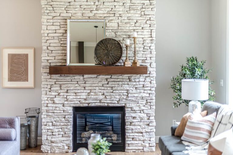
- Exposed or faux brick — Works well in more industrial or eclectic spaces; brick veneer panels are much easier to install than they look.
- Textured plaster or limewash — A soft, cloud-like, hand-applied texture that's currently trending for its organic, imperfect look — very different from a flat painted wall.
- Molding and trim (grid or picture-frame molding) — Adds architectural interest using paint-grade trim, often finished in a single color for a monochrome, tailored look.
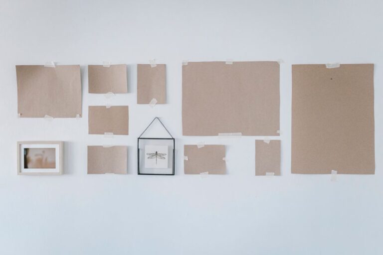
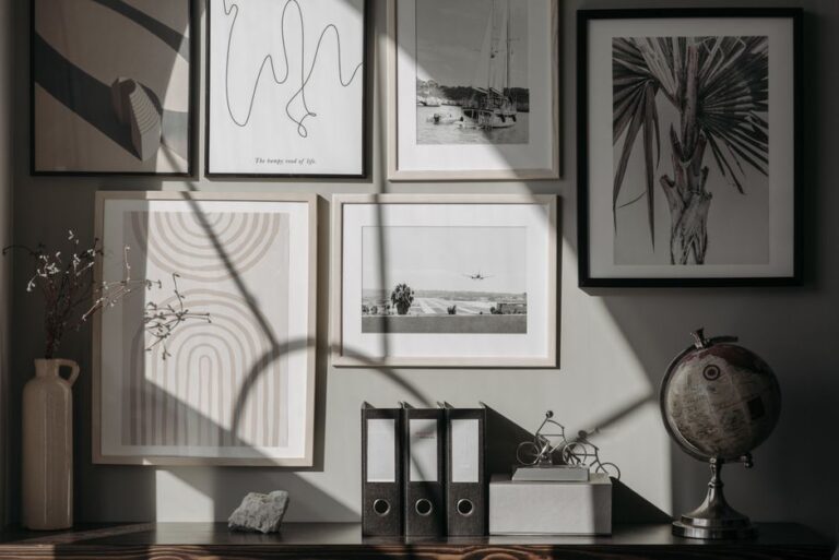
- Gallery of art or mirrors — Rather than a literal accent wall, densely arranging framed art or mirrors on one wall creates a similar focal-point effect without touching the paint at all.
How to pick an accent wall color
Go one or two shades darker or bolder than the rest of the room, not a completely unrelated color. If your walls are a soft greige, a navy, deep green, or terracotta accent wall will feel cohesive; a bright yellow accent in an otherwise neutral room will feel disconnected no matter how "on trend" the color is.
Look at your existing furniture and rugs first. The easiest way to choose a color that won't clash is to pull it from something you already own and love — a rug, a piece of art, even a throw pillow. This guarantees the room reads as coordinated rather than randomly decorated.
Consider the room's light. North-facing rooms tend to get cooler, flatter light and can handle richer, warmer accent colors well. South-facing rooms get warmer light throughout the day and can carry cooler tones like blues and greens without feeling cold.
Where accent walls work best
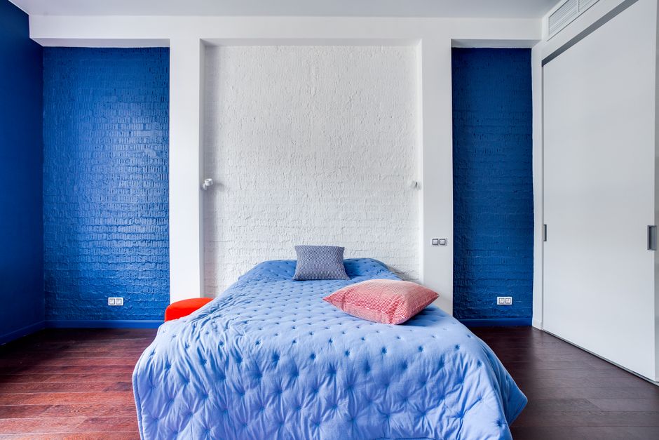
- Behind the bed — the most popular placement, since it instantly becomes the room's visual anchor without competing with anything else.
- Behind the sofa in a living room — especially effective in open-concept spaces where a color block helps define the "living room" zone.
- Behind open shelving or a media console — makes displayed items and electronics look styled rather than just placed against a blank wall.
- A stairwell or entryway wall — a high-impact way to make a small, transitional space feel considered.
Avoid accent walls in very small rooms with low ceilings if you're using a dark color — it can make the space feel like it's closing in. In small rooms, a lighter, warmer accent tone or a textured wallpaper reads as cozy rather than cramped.
Common mistakes to avoid
Choosing a trendy color you won't love in two years. Accent walls are meant to be semi-permanent. Pick a color you'd still be happy with after the trend cycle moves on, not just whatever's popping up on your social feed this month.
Skipping the sample stage. Paint always looks different on your actual wall, under your actual lighting, than it does on a swatch or online. Buy a sample pot, paint a two-foot square, and look at it morning, afternoon, and evening before committing to the full wall.
Forgetting the finish. A high-gloss or satin finish on a bold color reads very differently than the same color in matte. Darker accent colors often look richer and less "painted" in a matte or eggshell finish.
Making every wall an accent. The whole point of an accent wall is contrast — if two or three walls in the room are all doing something different, nothing stands out and the room can feel chaotic instead of curated.
The takeaway
A good accent wall comes down to picking the one wall that actually deserves the attention, choosing a color or texture that relates to the rest of the room rather than fighting it, and committing to the finish once you've sample-tested it properly. Done right, it's one of the highest-impact, lowest-cost changes you can make to a room.
Frequently asked questions
Which wall should be the accent wall?
The wall your eye naturally lands on when entering the room — typically behind the bed, behind the sofa, or directly opposite the doorway. Choose a solid, uninterrupted wall rather than one broken up by doors or windows.
Do accent walls need to be a dark color?
No. Light, warm tones or textured wallpaper can work just as well as an accent, especially in smaller rooms where a dark color risks feeling heavy.
Are peel-and-stick wallpaper accent walls durable?
Quality peel-and-stick wallpaper can last several years when applied to a properly prepped, smooth wall, and it removes cleanly — making it a solid option for renters who still want the accent-wall look.
How do I know if an accent wall color will clash with my furniture?
Pull the color from something you already own and love, like a rug or piece of art, rather than choosing in isolation. Testing a sample patch on the actual wall for a full day is the safest way to confirm it works with your existing pieces.
Read next

The part that actually matters
A wall broken up by multiple doors or windows loses most of an accent color’s visual impact even when the shade itself is a great choice, since the color gets chopped into fragments instead of reading as one deliberate block — the wall choice matters more than the color choice. Paint that looks right on a swatch often shifts noticeably once it’s on an actual wall under a room’s real lighting, which is why a two-foot sample patch checked at three different times of day catches mismatches a store swatch never reveals.
Further reading & trusted sources
Sofia is happiest hunting down the high-end look for a fraction of the price; she’s convinced a beautiful room comes from restraint and clever styling far more than from budget. She shapes Dreamy Dwell’s room-by-room guides around ideas you can actually copy in a rental or on a tight budget — no staged ‘this is my mansion’ fantasy. AI tools help with the research and first drafts, and a human edits every piece before it goes live. We never fake reviews or pass off a styled photo as a real before-and-after.