 By Sofia Bennett, Home & Decor Editor
Reviewed & updated September 2026
Floating shelves are one of the easiest ways to add personality and storage to a room without eating up floor space — but a badly styled shelf can look cluttered or oddly empty just as fast as a well-styled one looks intentional. The difference usually comes down to a handful of layout principles, not expensive decor.
 On this pageCurated by Sofia · 7 min read
- Start with the rule of odd numbers
- Vary height, not just width
- Layer front to back, not just left to right
- Layout 1: The book-and-object stack
- Layout 2: The plant anchor
- Layout 3: The symmetrical pair (for a calmer look)
- Layout 4: The gallery shelf
- Layout 5: The functional-decorative mix
- Keeping it easy to maintain
- The takeaway
- Further reading & trusted sources
Start with the rule of odd numbers
Groupings of three or five objects tend to look more visually interesting than groupings of two or four, because odd numbers avoid the perfectly symmetrical, slightly stiff look that even pairs create. This doesn't mean you need to count obsessively — it's a starting guideline. Pull together a small cluster of items (a stack of books, a small vase, a piece of art) and step back to see if it reads as balanced rather than scattered.
Vary height, not just width
The single biggest mistake in shelf styling is placing everything at the same height — a row of items that are all roughly the same size reads as flat and boring, even if each individual piece is beautiful. Mix tall and short: a tall vase or framed piece next to a stack of two or three books, next to a small short object like a candle or bowl. That variation in height is what makes a shelf feel curated instead of just placed.
Layer front to back, not just left to right
Instead of lining everything up in a single row, bring some pieces slightly forward and tuck others slightly behind. Leaning a framed print against the wall behind a shorter object, for example, adds depth that a straight row can't. This layering trick is especially useful on narrower shelves where you don't have much width to work with but still want visual interest.
Layout 1: The book-and-object stack
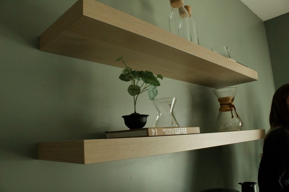
Stack 3-5 books horizontally, then place a small object — a candle, a small plant, or a miniature sculpture — on top of the stack. This is one of the most reliable layouts because books provide natural height variation on their own, and the object on top adds a personal touch. Vary the book spine colors or turn a few pages-out for a more neutral, cohesive look if your book collection is visually busy.
Layout 2: The plant anchor
Use a trailing plant (pothos or a faux version works well if you don't get much natural light) as your anchor piece toward one end of the shelf, letting it spill down slightly over the edge. Balance the other end with a stack of books or a small stack of boxes, and fill the middle with one or two smaller accent pieces. The trailing plant naturally breaks up the straight horizontal line of the shelf itself.
Layout 3: The symmetrical pair (for a calmer look)
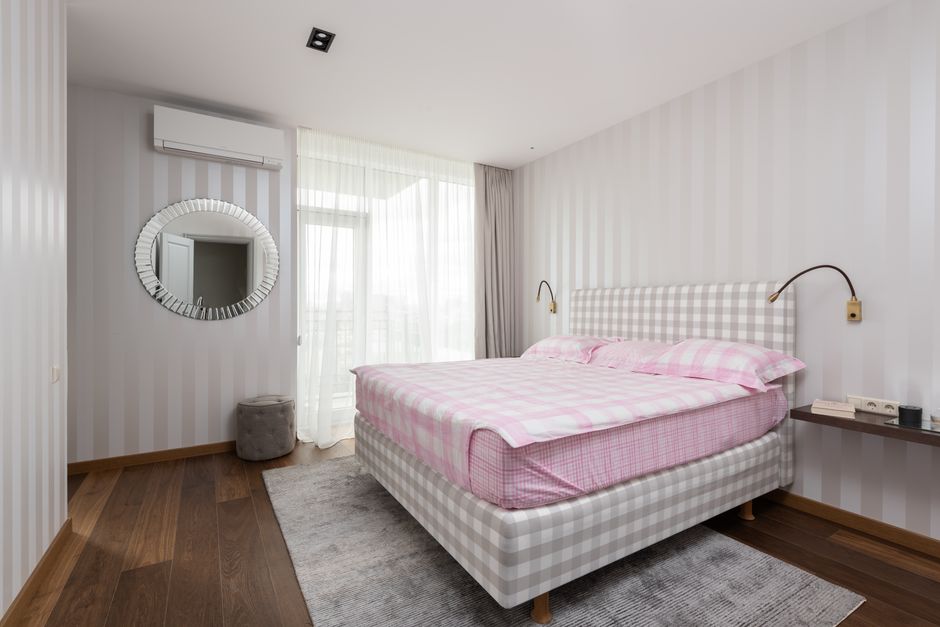
If your room already has a lot of visual texture, sometimes a simpler, more symmetrical shelf is the better call. Two matching bookends or vases at either end, with one or two small objects in the middle, creates a calmer, more restful look — useful for a bedroom shelf near a headboard where you want the space to feel settled rather than busy.
Layout 4: The gallery shelf
Lean two or three small framed prints against the wall rather than hanging them, overlapping the edges slightly, then add one small object in front for depth — a tiny plant or a small stack of two books. This works particularly well for shelves above a desk or reading nook and gives you the flexibility to swap art in and out without repatching wall holes.
Layout 5: The functional-decorative mix
For a kitchen or entryway shelf that needs to actually hold things you use, mix genuinely functional items (a small basket for keys, a mug you actually drink from) with one or two purely decorative pieces. This keeps the shelf from feeling like a museum display while still looking pulled together — the trick is limiting it to one or two "useful" pieces so it doesn't slide into clutter.
[TAKE] A detail that makes a real difference and gets skipped constantly: leave visible negative space on the shelf. A shelf styled edge-to-edge with objects reads as cluttered no matter how nice each individual piece is — aim for roughly a third of the shelf's surface to be empty wall or shelf space. That breathing room is what makes the styled portion look intentional rather than crammed.
Keeping it easy to maintain
Floating shelves collect dust fast since there's nothing enclosing the items. Choosing fewer, larger pieces over many tiny knick-knacks makes wiping the shelf down a two-minute job instead of a full unpacking-and-repacking event, and it usually looks more polished anyway.
The takeaway
Good floating shelf styling comes down to a few repeatable moves: group in odd numbers, vary height deliberately, layer front-to-back for depth, and leave some negative space so the eye has somewhere to rest. Pick one of the five layouts above as a starting template and adjust it to whatever decor you already own — you don't need to buy new pieces to make a shelf look considered.
Frequently asked questions
How many items should go on one floating shelf?
For a standard 24-36 inch shelf, 3-5 items is usually the sweet spot. Fewer than that can look sparse unless you're going for a very minimal look; more than that starts to feel cluttered.
What height should I hang floating shelves at?
For shelves above a sofa or bed, roughly 8-12 inches above the furniture back is a common starting point. For a standalone wall, eye level (around 57-60 inches to the shelf's center) works well as a general reference.
Do floating shelves need to be perfectly matched in style?
No — a mix of textures and finishes (wood, ceramic, glass, metal) generally looks more interesting than everything matching exactly. The goal is a cohesive feel through repeated colors or shapes, not identical materials.
How do I keep a floating shelf from looking too busy in a small room?
Stick to a tighter color palette (2-3 colors max across all styled objects) and lean toward fewer, slightly larger items rather than many small ones. A busy shelf in a small room competes with the rest of the space instead of complementing it.
Read next
Further reading & trusted sources
The detail most people miss
Leaving roughly a third of a floating shelf’s surface as visible negative space is what actually separates a styled shelf from a cluttered one — packing every inch with objects makes even genuinely nice pieces read as busy. Front-to-back layering, like leaning a frame behind a shorter object, adds real depth on narrow shelves where there isn’t enough width to spread items left to right.
Sofia is happiest hunting down the high-end look for a fraction of the price; she’s convinced a beautiful room comes from restraint and clever styling far more than from budget. She shapes Dreamy Dwell’s room-by-room guides around ideas you can actually copy in a rental or on a tight budget — no staged ‘this is my mansion’ fantasy. AI tools help with the research and first drafts, and a human edits every piece before it goes live. We never fake reviews or pass off a styled photo as a real before-and-after.