 By Sofia Bennett, Home & Decor Editor
Reviewed & updated September 2026
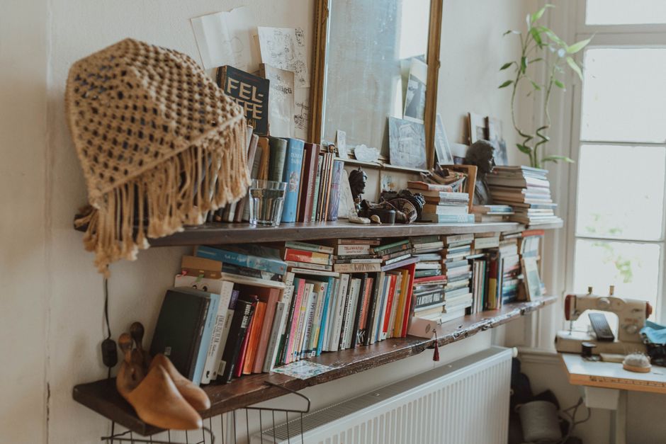
Most bookshelves fail for the same reason: every shelf crammed wall-to-wall with spines. The fix designers lean on is counterintuitive — leave gaps, mix in a few objects, stack some books flat. Done right, a shelf becomes the best-looking thing in the room for almost no money.
 Skip ahead toCurated by Sofia · 6 min read
- Start by clearing everything off
- The designer’s toolkit: what goes on a shelf
- Mix vertical and horizontal books
- Work in triangles and odd numbers
- Vary height, and leave negative space
- Add depth with layering
- Pull it together with a color story
- The takeaway
- Related articles
- Further reading & trusted sources
Start by clearing everything off
It's tempting to rearrange in place, but the best results come from a blank slate. Take everything off the shelves, dust them down, and sort your items into three piles: books, decorative objects (vases, bowls, sculptures, candles), and personal pieces (photos, travel finds, ceramics). Editing is half the work — a styled shelf has breathing room, so be willing to set aside anything that feels like filler.
The designer's toolkit: what goes on a shelf
A bookshelf that looks intentional usually mixes five ingredients. Aim to have a few of each:
- Books — stacked horizontally and standing vertically (more on this below).
- Greenery — a trailing plant or two softens hard lines instantly. Faux is fine if light is poor.
- Objects with height — a tall vase or sculpture to break up rows of books.
- Something round — a bowl, a globe, a curved vase. Curves balance all the straight book spines and shelf edges.
- Personal touch — a framed photo, a piece of pottery, a small piece of art leaned (not hung) against the back.
Mix vertical and horizontal books
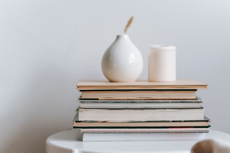
This is the single most effective designer trick. Instead of standing every book upright like a library, alternate: stand some books vertically, then lay a small stack horizontally beside them. The horizontal stacks double as little pedestals — set a small object (a candle, a crystal, a tiny plant) on top to add a layer. This rhythm of upright-then-stacked is what makes a shelf look styled rather than just stored.
For a calmer, more high-end look, turn a few books spine-in so you see the soft page edges, or wrap a few in neutral paper. Use this sparingly if you actually want to find your books.
Work in triangles and odd numbers
Designers arrange objects in triangles: place a tall item on one shelf, then balance it with a medium item diagonally on another shelf, and a low item diagonally again. Your eye travels across the whole unit instead of getting stuck in one spot. Group small objects in odd numbers — threes and fives feel more natural and dynamic than pairs, which can look stiff and matchy.
Vary height, and leave negative space
Two rules that separate "styled" from "stuffed":
- Vary the heights within each shelf — tall, medium, short — so the eye has somewhere to move. A row of items all the same height reads flat.
- Leave negative space. Empty space isn't wasted space; it's what lets the pieces you do display feel special. If a shelf feels crowded, remove a third of what's on it.
Add depth with layering
Flat shelves look flat. Create depth by layering front to back: lean a small framed print or piece of art against the back of a shelf, then place a shorter object or a stack of books in front of it. This overlap tricks the eye into reading the shelf as three-dimensional and gallery-like.
Pull it together with a color story
A shelf instantly looks more cohesive when it follows a loose color palette. Pick two or three tones that echo your room — warm neutrals with a touch of green and brass, say — and let your objects lean into them. If your books are a chaotic rainbow of spines, balance them by grouping similar colors together, or tuck a few behind objects so the overall effect stays calm.
The takeaway
Styling a bookshelf comes down to a handful of principles: clear it off and edit ruthlessly, then mix books standing and stacked, add greenery and a few curved and tall objects, and arrange everything in triangles and odd numbers. Vary the heights, layer pieces front to back for depth, follow a simple two- or three-color palette, and — most importantly — leave breathing room. Style it, step back, and tweak: the best shelves are arranged by eye, adjusted until the whole thing simply feels balanced.
Frequently asked questions
How do I style a bookshelf so it doesn't look cluttered?
Edit first — remove about a third of your items and leave deliberate negative space. Group objects in odd numbers, vary their heights, and balance books with a few decorative pieces and plants rather than filling every inch. Breathing room is what makes a shelf look styled instead of stuffed.
Should books be vertical or horizontal on a shelf?
Use both. Stand some books upright and lay others in short horizontal stacks beside them, then set a small object on top of the stacks. Alternating the two creates rhythm and gives you little pedestals for decor — the look designers rely on.
What should I put on a bookshelf besides books?
Mix in greenery (real or faux), a tall vase or sculpture for height, something round like a bowl, candles, and a personal piece such as framed art leaned against the back. Aim for a few of each and keep them within a loose two- or three-color palette.
How do designers make shelves look high-end?
They edit down, layer pieces front to back for depth, arrange objects in triangles across the shelves, vary heights, and stick to a cohesive color story. Leaning art instead of hanging it and turning a few books spine-in are easy tricks that add that polished, gallery-like feel.
Read next
Related articles
- Living Room Lighting Ideas for a Cozy, Inviting Glow
- “Small Living Room Layout Ideas That Actually Maximize Space”
- Renter-Friendly Apartment Decorating Ideas
- How to Make a Small Room Look Bigger
- Cozy Reading Nook Ideas You’ll Want to Curl Up In Right Now
- How to Choose the Right Rug Size for Any Room
Further reading & trusted sources
The detail most people miss
The fix for a cluttered shelf is negative space, plus stacking some books horizontally to act as risers for objects. Leave gaps on purpose; a shelf crammed wall-to-wall reads as storage, not styling.
Sofia is happiest hunting down the high-end look for a fraction of the price; she’s convinced a beautiful room comes from restraint and clever styling far more than from budget. She shapes Dreamy Dwell’s room-by-room guides around ideas you can actually copy in a rental or on a tight budget — no staged ‘this is my mansion’ fantasy. AI tools help with the research and first drafts, and a human edits every piece before it goes live. We never fake reviews or pass off a styled photo as a real before-and-after.